Interior finishes to review before building
Interior finishes are chosen one at a time, in different showrooms, on different days, under different lighting. They are then experienced all at once, in a single room, under one set of conditions. That mismatch is the single largest source of disappointment in a luxury home, and it is entirely avoidable.
The homes that feel resolved are not the ones with the most expensive finishes. They are the ones where the finishes were reviewed as a coordinated system before anything was ordered. This pillar sets out what interior finishes actually include, how to review them together rather than in isolation, the stories behind the materials that make a luxury palette work, and what still has to be confirmed outside a visual review.
Learn more: architectural visualisation Melbourne for project decisions

What interior finishes include
- Fixed finishes versus loose furnishings: Fixed finishes are the ones built into the home, including flooring, wall linings, joinery, benchtops, tiles, tapware and lighting. Loose furnishings can be changed later; fixed finishes largely cannot, which is why they deserve the review effort.
- Visual, tactile and technical product information: Every finish carries three layers of information: How it looks, how it feels, and how it performs. A sample board answers the first, partly answers the second, and says nothing about the third.
- Why finishes should be reviewed as a coordinated system: Materials borrow colour from each other, reflect each other and compete with each other. A palette is a set of relationships, not a set of products, and relationships can only be judged together.
Key insight: Almost every finish looks good on its own. That is what showrooms are designed to achieve. The only useful question is whether it looks good next to the other six things you have chosen, in your room, in your light.

Floors, walls and ceilings
These three surfaces make up most of what the eye sees, so they set the tone before any fixture is noticed.
- Colour, undertone and pattern: Undertone is what clashes, not colour. Two warm greys with different undertones, one leaning green and one leaning pink, will fight each other in a way no sample board reveals.
- Texture and light response: A textured surface only reads as textured when light strikes it at an angle. The same finish can look flat under downlights and dramatic under a wall wash.
- Scale and continuity: Large-format surfaces show variation and pattern repetition that a small sample cannot. Continuity between rooms, and how each surface terminates, is what separates a resolved interior from a collection of separate rooms.
Learn more: comparing timber flooring and composite decking with 3D
Joinery, stone and metals
- Joinery: Timber species, cut, grain direction and door profile determine whether joinery reads as furniture or as a wall. Hardware finish should belong to the same metal language used elsewhere in the home.
- Stone and engineered surfaces: Benchtops and vanity tops carry both a visual and a performance decision, and the two often pull in opposite directions.
- Metals: Tapware, hardware, lighting and balustrade fixings should share a deliberate finish language. Mixed metals can work, but only when the mix is intentional and repeated.
Glazing, fixtures and fittings
- Glazing: Frameless glass, mirror and glass balustrades reflect their surroundings, so they must be judged in context rather than in isolation. Glass also transmits and tints light, changing what sits beyond it.
- Fixtures: Tapware, basins, sinks and sanitaryware combine appearance with daily ergonomics, and the finish tier is one of the clearest signals of a home’s standard.
- Fittings and detailing: Grates, channels, shadow lines, niches and trims are small items that carry disproportionate weight in how considered a home feels.
Learn more: bathroom remodel cost in Australia
How lighting changes every finish you choose
Lighting is not a separate decision from finishes. It is the condition under which every finish will be judged, so it belongs in the same review.
Why the same finish looks different under different light
- Light source and direction: Grazing light exaggerates texture, while flat frontal light suppresses it.
- Colour temperature and intensity: A warm 2700K source pushes timber and brass warmer and can grey out cool tones, while a cooler 4000K to 5000K source sharpens whites and can flatten the same timber.
- Surrounding colours and reflected light: Finishes borrow colour from their neighbours. A green garden outside a large window, a dark floor or a strong joinery colour will tint everything around them.
Natural and artificial light
- Orientation and time of day: North-facing rooms receive the most consistent daylight in Australia, while south-facing rooms sit in cooler, more even light. Morning, midday and late-afternoon light differ in both angle and warmth.
- Lighting layers: Ambient light sets the mood, task light is where colour accuracy matters most, and accent light deliberately exaggerates texture on stone, joinery or art.
- Material response: Gloss reflects its surroundings while matte scatters light, translucent materials transmit it, and dark finishes absorb it while pale finishes bounce it.
How to compare finishes fairly
- Lock the scene: Keep the same viewpoint, lighting and surrounding finishes for every option.
- Change one variable at a time: The floor, or the tapware finish, or the light temperature. Never several at once.
- Review day and evening: Confirm the palette works in daylight and under the designed lighting, because the home is used in both.
- Record assumptions: Note what was assumed where information was incomplete, so the review can be audited later.
The stories behind a luxury finishes palette
Materials are easier to choose well when you understand how they are made. These are the finishes that recur in high-end Australian homes, including Project 251, an in-progress residential project in Edithvale VIC. Everything shown in that project is indicative of the design direction and is not a final selection.
PVD brushed brass: Why warm metals came back
Brass and gold tapware disappeared from serious specification for years, because traditional electroplated finishes wore unevenly and discoloured in wet areas. What changed is the coating. PVD, or physical vapour deposition, bonds an extremely thin, hard layer to the substrate in a vacuum chamber, producing a finish substantially more durable and colour-stable than electroplating. Australian brands including ABI Interiors, based on the Gold Coast, now finish full ranges this way and sell direct.
What this means for your decision: A PVD brushed brass or gold finish carries a premium over chrome on every item, and because a coherent home repeats the same finish across tapware, hardware, accessories and fixings, that premium multiplies. It is also one of the cheapest ways to make a home read as designed rather than assembled, so decide the metal language early and hold it.
Sintered stone against natural travertine
These two surfaces represent opposite philosophies. Sintered stone is manufactured under intense heat and pressure into a dense, non-porous slab engineered to resist heat, scratching and staining. Travertine is sedimentary rock formed over geological time, porous, characterful and full of the voids and banding that record how it was laid down.
One is predictable, the other is singular. The best luxury interiors usually use both, putting the engineered surface where life happens and the natural stone where it can be looked at.
What this means for your decision: Match the surface to the duty. Confirm sealing, maintenance and heat tolerance with the supplier, and review large-format surfaces at full scale, because pattern and variation only appear at room size.
American Oak and the wood-free board
American Oak dominates premium Australian interiors because it is dimensionally reliable, takes a wide range of finishes and has an open grain that reads well at room scale. The subtlety is that “oak” is a species, not a look: Plain-sawn boards show broad cathedral figure, quarter-sawn boards show straighter grain with medullary rays, and grade determines how much knot and colour variation arrives.
Outdoors, the equation changes. Millboard takes the opposite approach to timber decking and cladding: The boards are hand-moulded from casts taken off real oak planks, contain no wood fibre at all, and are hand-coloured rather than printed, so the pattern does not repeat across a large deck. You get the oak surface without the oiling, splitting and greying that a coastal climate imposes on real timber.
What this means for your decision: Inside, ask for the grade and the cut, not just the species. Outside, decide whether you want authentic material with maintenance or a reproduction with less of it, and confirm fixing, joist spacing and warranty conditions, because a wood-free board installs to its own rules.
Sculpted rock and the case for one handmade thing
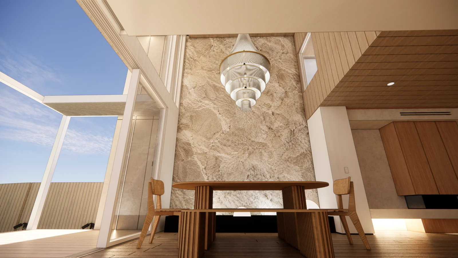
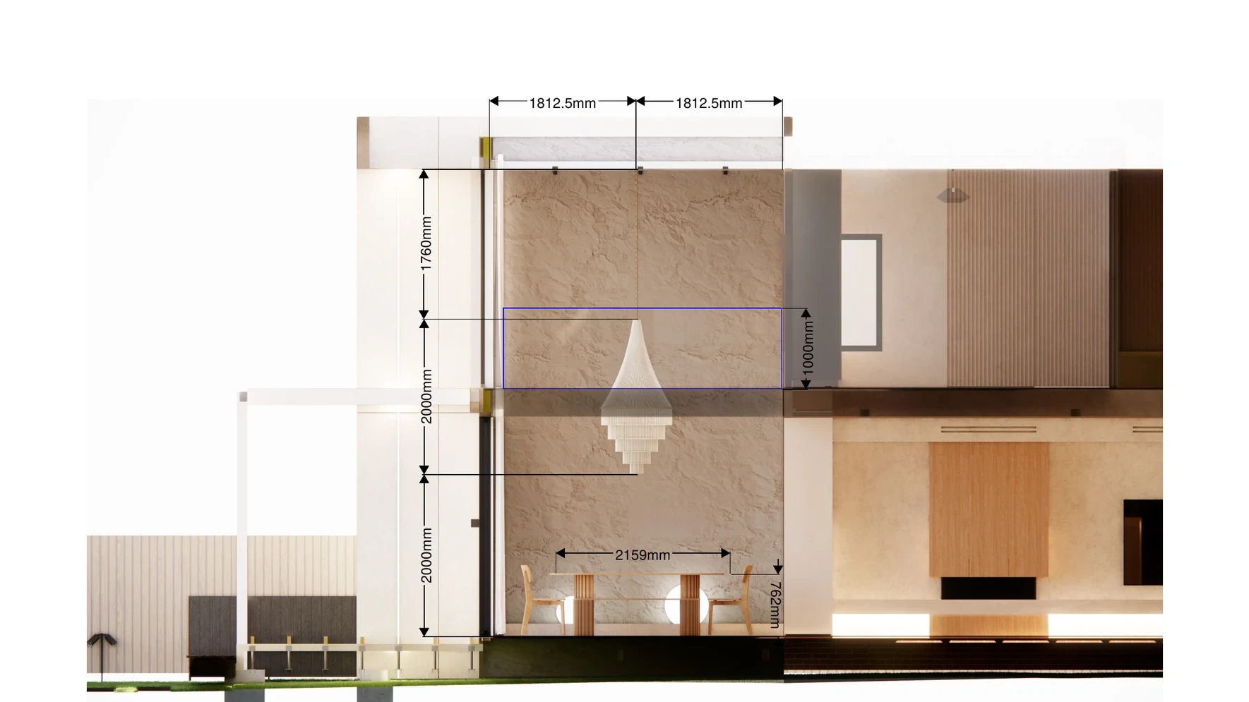
A luxury palette built entirely from engineered surfaces can end up feeling immaculate and cold. The correction is usually a single handmade element: A sculpted rock wall, a carved pedestal supporting a benchtop, an organic form that no factory produced. In Project 251 this appears as sculpted rock forms with graded relief, lit to reveal texture.
What this means for your decision: One or two handmade elements do more for warmth than a dozen expensive products. Place them where they will be touched or seen daily, and light them deliberately, because a sculpted surface without raking light is just a lump.
Frameless glass: The finish you are meant not to see
Frameless glass is specified precisely so it disappears, in showers, balustrades and, in Project 251, as an ultra-clear glass curtain to a water feature. Standard float glass carries a green tint from its iron content, which is invisible in a window and very visible on a thick edge or across a large pane. Low-iron, ultra-clear glass removes it.
What this means for your decision: Confirm whether you are getting standard or low-iron glass, because on a feature element the edge tint is the difference between invisible and green. Also settle the fixing method early, since channels and recesses are structural decisions, not finishing ones.
Key insight: Every material above is a different answer to the same question: How to get the character of natural material with the performance a modern home demands. Knowing which trade-off you are making is what turns a shortlist into a decision.
A finishes review workflow
| Step | What to do | Why it matters |
|---|---|---|
| Assemble the palette | Bring every fixed finish for the room into one scene | Relationships are the whole point |
| Set the conditions | Fix camera, daylight and artificial lighting | Only a controlled scene gives a valid comparison |
| Test one variable at a time | Change one finish per round | Isolates what is driving the preference |
| Review at full scale | Include a room view, not only close-ups | Pattern and variation appear at scale |
| Record and assign | Log the decision, the assumption and the owner | Prevents the choice being re-litigated later |
| Confirm physically | Check samples and specifications before ordering | Screen review never replaces a physical sample |
The interior finishing process, stage by stage
Interior finishing is the sequence in which fixed finishes are installed and signed off: Services rough-in, waterproofing, tiling, joinery, flooring, painting, then fit-off. Each stage closes the one before it. The finishes schedule carries every selection through that sequence, and each line has a point beyond which change stops being free.
Interior finishes are the products. Interior finishing is what happens to them on site: The order of installation, the trade that owns each line, and the moment each decision becomes physical. Most finishes disputes are not disagreements about taste. They are decisions that arrived after the stage that needed them had already passed.
| Stage | What is decided here | The point of no return |
|---|---|---|
| Design and documentation | The full palette and the room-by-room finishes schedule | None. Every change is still free |
| Services rough-in | Mixer and outlet positions, wall-hung or floor-mounted pans, niche and shelf positions, floor waste type, light and switch positions | Wall and ceiling linings are fixed |
| Waterproofing and screed | Floor levels, fall to waste, hob or hobless shower, threshold detail | The membrane is applied and inspected to AS 3740 |
| Tiling | Tile size and format, setout, grout colour, edge and trim detail | Adhesive is set on the first wall |
| Joinery manufacture | Timber species, cut and grade, door profile, carcase dimensions, hinges and runners | Shop drawings are signed and sheets are cut |
| Benchtops | Slab selection and slab layout, edge profile, cutout and tap-hole positions | The template is taken and the slab is cut |
| Flooring | Board width, direction, finish and coating system | Material is delivered and acclimatising on site |
| Doors and hardware | Leaf size, jamb and shadow-line detail, hinge type, lever and finish | Frames are fixed and architraves or shadow lines are set |
| Glazing | Standard float or low-iron glass, thickness, fixing method, channel or spigot | Channels and recesses are cast or framed |
| Painting | Colour and sheen level per surface | The second coat |
| Fit-off | Final tapware, sanitaryware, lighting and accessory models | The purchase order is placed, because most premium items are made to order |
| Window furnishings | Track, pelmet and recess detail, motorisation and cabling | The ceiling recess or pelmet is built |
What a finishes schedule has to carry on every line:
- One line per item, per room: A schedule organised by product rather than by room hides the gaps. Organise by room, then by trade, so an omission is visible.
- Brand, range, model and code: A product code is what a supplier can quote and a builder can order. A range name alone is not an instruction.
- Colour, finish and size: The three attributes most often left open, and the three that most often arrive wrong.
- Quantity and coverage: Square metres, linear metres or item count, with the rooms named.
- Supplier, quoted lead time and order-by date: The order-by date is the only field that connects the schedule to the programme.
- Installing trade and installation stage: Names who is blocked when the item is late.
- Status and decision owner: Selected, approved, ordered, delivered, installed. One named owner per open line.
Where the finishes schedule sits on the programme of works
A finishes schedule is a procurement instrument before it is a design document. Every line carries a lead time, and it is the lead time, not the taste decision, that puts a finish on the critical path.
On a programme of works, each finish resolves to three dates: Order by, deliver by, install by. Order-by is the install date less the quoted lead time less float. Items with long or uncertain lead times, typically imported tapware, stone slabs, custom joinery hardware, motorised window furnishings and specified light fittings, sit on the critical path because the following trade cannot start without them. A tiler cannot set out around a niche with no tile on site, and a plumber cannot fit off with no mixer.
Plan-versus-actual tracking is what turns that into an early warning. Each line carries a planned order date and a planned delivery date, and the status update compares actual against planned, flagging variance while there is still float to spend. A finish that will not arrive in time shows up as a missed order-by date weeks before it shows up as an idle trade on site. Cash-flow analysis attaches deposits and progress claims to the same dates, so procurement and drawdown move together rather than surprising each other.
Key insight: Recovering a slipped order-by date usually costs freight or a substitution. Recovering a slipped install date costs the trade’s return visit plus every trade queued behind it.
This is where reviewing the palette immersively earns its place on the programme. Materials reviewed and approved in VR before ordering are locked once, so the order-by dates hold. Reopening a selection after the order has gone in converts a free decision into a restocking negotiation and a resequenced programme.
>>> Learn more about what actually drives a kitchen renovation cost in Melbourne
How to compare interior finishes across builder packages
Compare builder packages line by line against one common finishes schedule, not brochure against brochure. For each category, establish what the standard inclusion genuinely covers, what the upgrade tier adds, whether the item is named or carried as an allowance, and who pays when the named product cannot be supplied. The differences sit in the allowances.
Premium home interior finishes are where two otherwise similar packages diverge most, and where the divergence is hardest to see before signing. Treat this as a project control exercise: Read the schedule as a contract document, test what each line actually commits the builder to, and quantify the exposure that is left open. It is not a matter of taste, and it is not a design service.
| Category | What a standard inclusion usually means | What the upgrade tier usually adds | What to check on the schedule |
|---|---|---|---|
| Flooring | A nominated range in a limited colour set, laid in a standard pattern, skirting to match | Wider or longer boards, engineered timber or large-format tile, specified direction, feature setouts | Board or tile size, coverage room by room, wet-area slip classification to AS 4586, whether underlay and trims are included |
| Joinery and benchtops | Laminate or melamine carcases and fronts, a nominated benchtop range, standard hardware | Timber veneer or two-pack fronts, stone or sintered benchtops, integrated handles, specified hinges and runners | Whether the benchtop is a named slab or an allowance, edge profile, waterfall ends, and who selects the actual slab |
| Tapware and sanitaryware | One nominated brand and range in chrome, standard pans and basins | PVD and specialty finishes, wall-mounted mixers and spouts, wall-hung or back-to-wall pans, concealed cisterns | Finish named or “as selected”, whether the rough-in body is included, and a stated lead time per item |
| Doors and hardware | Standard-height hollow-core internal doors, one nominated lever range | Full-height or oversized leaves, solid core, concealed hinges, shadow-line jambs, matched lever and hinge finish | Door height and leaf construction stated per opening, and whether the hardware finish matches the tapware language |
| Glazing | Standard float glass to showers, mirrors and balustrades, framed or semi-frameless | Low-iron ultra-clear glass, frameless fixings, channel-set balustrades, oversized panes | Glass type and thickness against AS 1288, whether “frameless” means channel-set or spigot-fixed, and edge treatment |
| Lighting | A fixed downlight count per room, one nominated fitting range | Specified fittings, separate ambient, task and accent circuits, dimming and colour temperature control | Fitting count per room, colour temperature, dimming method, and whether the count is an allowance or a documented layout |
| Window furnishings | Roller blinds to habitable rooms, manual operation, no pelmet | Recessed pelmets, sheer and blockout layering, motorisation, specified fabric | Whether the ceiling recess is a base-build item, whether motor cabling is included, and coverage room by room |
| Wall and ceiling finishes | Painted plasterboard, standard cornice, a three-coat system in a nominated colour | Square-set junctions, shadow lines, panelling, specialty render or micro-cement, feature tiling | Sheen level per surface, square-set nominated room by room, and whether preparation and patching are included |
Ten criteria for reading a finishes schedule honestly
- What a prime cost allowance really means: A prime cost item is a supply-only allowance for a product not yet chosen, such as tapware, tiles or a basin. It estimates the supply cost and excludes installation labour. If the item you eventually select sits above the allowance you pay the difference, generally with the builder’s margin applied. In Victoria the Domestic Building Contracts Act 1995 requires these amounts to be based on reasonable estimates, which is exactly why a thin allowance against a premium item is a warning rather than a saving.
- What a provisional sum really means: A provisional sum covers both supply and installation for work that is not yet fully documented, such as a stone benchtop run or bespoke joinery. It carries more uncertainty than a prime cost item because product and labour are both estimated. Count the provisional sums: A schedule with many of them is a schedule that has not been resolved.
- Brand and range named versus “or equivalent”: A named brand, range and product code commits the builder to that item. “Or equivalent” and “or similar” transfer the choice to the builder, and equivalence is usually judged on function rather than appearance. Either strike the phrase out or define the equivalence test before signing.
- Finish and colour specified versus “TBC”: “TBC”, “as selected” and “to client selection” are open lines. They are not free. They defer the decision to a point where the programme, not the palette, decides the answer. Put a date against every one of them.
- Quantity and coverage: An inclusion is only as good as its extent. “Engineered oak flooring” means little without the rooms it covers, the square metres and what happens in the rooms it does not cover. Check wet areas, laundry, garage entry and stairs specifically.
- Supply only versus supply and install: A line can be priced as material only, with installation carried elsewhere or not at all. Confirm which, and confirm who is responsible for substrate preparation, setout and making good.
- Who bears the cost of a substitution: Ask what happens if the named product is discontinued or unavailable at the order date: Who selects the replacement, who approves it, and who absorbs the difference. A schedule that is silent on this defaults in practice to the builder choosing and the client paying.
- Lead time stated against each line: A lead time that appears nowhere in the schedule cannot be tracked on the programme, which means the first sign of a problem is an empty site.
- Price validity, escalation and rise and fall: Check how long supplier quotations hold, whether the contract allows escalation on nominated items, and what triggers it.
- Exclusions and “by others”: Read the exclusions list as carefully as the inclusions list. Recesses, blocking, cabling, waterproofing upgrades and specialty substrates are common “by others” items that quietly become the client’s scope.
What this means for your decision: Score both packages on the same eight categories and the same ten criteria before you compare anything else. The package with the more persuasive brochure is frequently the one with more open lines, and open lines are where the cost lands after the contract is signed.
Reviewing selections immersively before the contract is signed changes what the comparison is for. Rather than choosing between two written schedules, you check two resolved palettes at full scale in the actual rooms, and confirm whether the standard inclusion is genuinely acceptable instead of assuming the upgrade is necessary. DX Living does not specify finishes and does not supply them. The contribution is the review environment and the programme discipline that keeps the schedule honest, through DX Interiors for the palette and immersive full-scale review in DX Studio.
>>> Learn more about what actually makes a room cinematic
What still has to be confirmed outside a visual review
Being clear about the limits is what makes visual review trustworthy.
- Exact colour matching: Screen review compares options reliably; it does not match a specific colour. Confirm against a physical sample.
- Product performance: Slip resistance, wear ratings, water and heat resistance, acoustic performance and cleaning requirements come from supplier documentation, not renders.
- Photometric performance: Perceived brightness is not measured lux. Lighting levels, uniformity and compliance require specialist lighting design.
- Compliance and installation: Waterproofing to AS 3740, NCC compliance, substrate preparation and warranty conditions sit with the relevant trades and consultants.
Common mistakes with interior finishes
- Choosing finishes in isolation, in separate showrooms on separate days.
- Judging under showroom lighting, which is usually brighter and cooler than a home.
- Comparing at sample scale rather than room scale.
- Mixing metals without a rule, so the mix reads accidental rather than intentional.
- Leaving finishes until after procurement has started, when changes stop being free.
- Treating a render as a colour match instead of a comparison tool.
How DX Living supports finishes decisions
DX Living lets homeowners, designers and builders review a complete palette in the actual room, at full scale, under both daylight and the designed artificial lighting, through DX Interiors and immersive review in DX Studio. Supplier-linked material detail means options can be compared under identical conditions before anything is ordered. DX Living is a visualisation and coordination partner, not a supplier or builder, and product performance should always be confirmed with the manufacturer. See the DX Living project collection for examples.
Who delivered 251 Station St., and what each party was responsible for
A project this coordinated only works when every role is defined before work starts on site. The 251 Station St. team was structured so that design intent, buildability and compliance were resolved inside one shared model, rather than being reconciled through variations once the frame was up. The credits below name each party and the scope they carried.
Project Superintendent and Project Control: Feel DX
Feel DX held the superintendent and project control function, which means owning the programme, the decision register and the cost and time consequences of every change. This is the discipline that keeps a build predictable: A decision resolved before tender costs nothing, while the same decision made mid-construction is priced at the builder’s margin with no competitive leverage left.
Principal Building Contractor: Willoworks
Willoworks, a Bayside Melbourne residential and commercial builder and Master Builders member, held the construction contract and site responsibility, delivering the built work against the coordinated documentation.
Architect and co-design: Plico Design Studio with Feel DX
Plico Design Studio, a Port Melbourne practice known for architecture, interiors and heritage research, led the architectural design. Feel DX worked alongside them in a co-design capacity, testing spatial options and material decisions in the model so the client could review each choice at full scale before it was documented.
4D design and visualisation: Feel DX and DX Living
This is the core of the platform: A BIM-integrated model sequenced against the construction programme, so form, finish and staging can be interrogated together. Immersive review closes the gap between a drawing and lived spatial reality, which is where most late-stage change orders originate.
Interior and exterior design: Feel DX
Interior and exterior schemes were developed inside the same model rather than as a separate parallel workstream, keeping finishes, joinery and facade decisions aligned with the documented base build.
Building Surveyor: C & M Building Surveyors
Building permits, inspections and occupancy certification were handled by a registered private building surveyor, confirming compliance with the National Construction Code at each statutory hold point.
Key insight: The value in this structure is not that any one party did more. It is that design authorship, project control and visualisation shared a single source of truth, so decisions were made once, early, and in a form the client could actually see.
Conclusion
Interior finishes fail as a group, not individually. A palette that was chosen one product at a time, under showroom lighting, at sample scale, will almost always disappoint at room scale in real light. Reviewing every fixed finish together, under controlled conditions, changing one variable at a time, converts a set of preferences into a decision you can defend. Do it before procurement, while every choice is still free to change, rather than after the order is placed and the change is priced at the builder’s margin.
Ready to see your whole palette in one room before you order? Contact DX Living to explore supplier-linked material visualisation.
FAQs
Q: What are interior finishes?
A: Interior finishes are the fixed materials built into a home, including flooring, wall and ceiling linings, joinery, benchtops, tiles, tapware, hardware, glazing and lighting. They are distinct from loose furnishings, which can be changed later.
Q: Why should interior finishes be reviewed together rather than one at a time?
A: Because materials borrow colour from each other, reflect each other and compete with each other. A palette is a set of relationships, and relationships can only be judged when the finishes are seen together, in the room, under the same light.
Q: Can a render confirm the exact colour of a finish?
A: No. A render is excellent for comparing options in context and for judging how finishes work together, but exact colour, texture and product performance must be confirmed against physical samples and supplier specifications.
Q: When should finishes be locked in?
A: Before procurement. Finish decisions made during design cost nothing to change, while the same decisions revisited after ordering or during construction are priced at the builder’s margin, with little competitive leverage.
Q: Is it acceptable to mix metal finishes?
A: Yes, when the mix is deliberate and repeated. Problems arise when metals accumulate by accident across separate purchases. Decide the metal language early, then apply it consistently across tapware, hardware, lighting and fixings.
Q: How many materials should a room use?
A: As a working guide, two to three primary materials per space, with texture and detail providing interest rather than additional materials. Restraint is what makes a high-end palette read as calm rather than busy.
References
- Australian Building Codes Board. National Construction Code (NCC).
- Standards Australia. AS 3740 Waterproofing of domestic wet areas.
- Standards Australia. AS 4586 Slip resistance classification of new pedestrian surface materials.
- Australian Government. Your Home, guide to environmentally sustainable homes.
- Forest and Wood Products Australia. Timber technical guidance.
Recent Articles

3D rendering for home renovations in Australia: What it costs and what you see

House renovation in Adelaide: Reviewing the change in 3D before you commit